Posts

Workshop with Howard Rose

Image
After my workshop with Patti I stayed on at the Greenville Arms for the next workshop.  Howard Rose is an extraordinary landscape and still life artist.  I particularly like his seascapes and beach and dune paintings.  He lives and works in Long Island, NY, and about six of his students from his regular classes came to the workshop.  One in particular, Joan Stevens, is quite talented and assisted him when necessary.  It was a pretty large class, so it was nice having an assistant making the rounds as well.  Howard went above and beyond the regular class time of 9-4.  He would begin critiques of everyone's work at 4:30.  We barely got done in time for dinner!  He did a presentation after dinner every night.  The first night he highlighted all the various things we need to ask ourselves when critiquing or troubleshooting our work.  The second night's presentation was about all of his favorite contemporary artists. The third night he...

Workshop With Patti Mollica

Image
I just came back from a three-day workshop with Patti Mollica.  She is primarily an acrylic painter and has published quite a few books and you tube videos on both color theory and her technique of painting fast, loose, and bold.  You can check her out at www.pattimollica.com 3 tone value study Patti has a unique way of teaching how to loosen up in both style and color.  She began by having us break down complicated compositions into large defined value shapes using only white, black, and a middle grey.  3 tone value study Then she showed us how to match those values with color, encouraging us to use a variety of colors within each value range.  The idea was to apply color directly onto the value studies.  Patti works in acrylics, and her method works better in that medium.  I worked in oils, so my value studies were not dry enough to apply color on top.  I used my studies as references instead of under paintings. ...

Plein Air with Limited Palette

Image
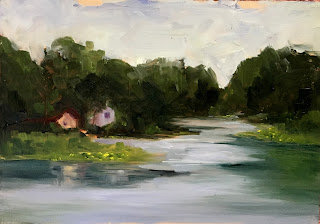
Primary Palettte, 5'x 7" I finally got a chance to do some plein air painting at our cabin on a small lake in North Jersey.  I had just finished reading Macpherson's "Landscape Painting", and tried two of his limited palettes.  The first is a primary palette of Cadmium Yellow Light,  Cadmium Red Light, Alizarin Crimson, Ultramarine Blue, and White. It felt a little constraining but I like the results.  I think I missed having Cerulean Blue and Cadmium Red Medium the most. The next day I tried his earth tone palette of Yellow Ochre, Burnt Sienna, Chromatic Black, and White.  This was a challenge!  It was impossible to get the colors that were actually in the landscape but at least the values were right.  I was surprised at how blue the Chromatic Black was when I added White.  But when mixed with the Yellow Ochre for green it worked more like Ivory Black and produced an olive green that really wasn't what I was going for. Earth Tone Palette...

Pewter & Pears

Image
"Pewter & Pears", Oil on Panel, 11"x 14" I finally got back to class after a ten week break while I was recuperating from my foot surgery.  It is a good thing I had done some painting in the past two months and I was able to complete this is two classes. The following pictures are the underpainting and the initial blockin.  The last picture is the finished painting and the set up. Underpainting in Transparent Red Oxide Initial Blockin Finished Painting & Set up The pitcher in the setup was actually a silver pitcher but I didn't really capture the quality of bright silver.  I liked it anyway, and my instructor thought it looked like pewter, and I couldn't resist the alliteration. Hence, "Pewter & Pears" It is for sale on my website.   Click Here To Buy

An Apple A Day

Image
"An Apple A Day"  Oil on Cradled Panel  6"x 6" I finally got back in the studio after a ten day hiatus.  (I needed to keep my foot elevated and I just can't paint that way.) I had absolutely no inspiration and no idea what to paint, but I knew I had to just DO something!  So I grabbed an apple, put it down and started painting.  I was so rusty I ended up wiping it out 8 times.  But I persisted. "Another Sunflower Painting", Oil on Cradled Panel, 6"x 6" I am so excited to be the Spotlight Artist of the week on the DailyPaintWorks site.  Click here to read my interview .  If you have purchased a painting from their website in the last 30 days you are eligible to enter to win this painting. Good Luck!

The Red Barn

Image
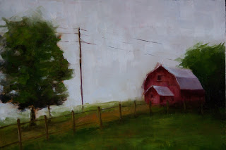
"The Red Barn"  Oil on Panel  9"x 12" While I am convalescing from my foot surgery, and can not attend my still life class, I am practicing landscape painting from photos.  This was a farm on a creek in the Chesapeake.  The original barn was white but it just didn't look right.  I know red barns are cliche but I just couldn't resist.  I was inspired by a fantastic YouTube video by Roger Dale Brown.  Check it out here .   He explains his process as he goes along and offers up so many tips and bits of knowledge.  It is worth watching a few times.  I am considering recreating his painting while watching the video and painting along with him. Click here for purchase information

Chesapeake Cove

Image
"Chesapeake Cove"  Oil on Panel  12"x 16" I originally planned this to be a larger studio painting of a plein air study I did during this past summer, entitled "From the Dock", pictured below.  But I just couldn't get the boats to look right.  It was such a struggle and so frustrating that I just decided to leave them out.  I might put them in another time when I get more experience painting boats. "From the Dock"  Oil on Panel  8"x 10" I attended a workshop with John MacDonald in the fall and learned that he always frames his paintings in order to see if they are finished.  He taught us that a frame can make a huge difference.  I definitely think this is true of this painting.  It looks finished in a frame.  What do you think? Chesapeake Cove framed Both of these are available on my website. Chespeake Cove From the Dock