 |
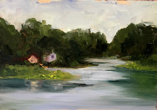
| Primary Palettte, 5'x 7" |
I finally got a chance to do some plein air painting at our cabin on a small lake in North Jersey. I had just finished reading Macpherson's "Landscape Painting", and tried two of his limited palettes. The first is a primary palette of Cadmium Yellow Light, Cadmium Red Light, Alizarin Crimson, Ultramarine Blue, and White. It felt a little constraining but I like the results. I think I missed having Cerulean Blue and Cadmium Red Medium the most.
The next day I tried his earth tone palette of Yellow Ochre, Burnt Sienna, Chromatic Black, and White. This was a challenge! It was impossible to get the colors that were actually in the landscape but at least the values were right. I was surprised at how blue the Chromatic Black was when I added White. But when mixed with the Yellow Ochre for green it worked more like Ivory Black and produced an olive green that really wasn't what I was going for.
 |
| Earth Tone Palette, 5"x 7" |
Then I tried a spilt primary palette of one cool and one warm of each primary. I used Cadmium Lemon Yellow for a cool yellow and Cadmium Yellow Medium for a warmer yellow. Cadmium Red Light was my warm red and Alizarin Crimson was my cool red. I used both Ultramarine Blue (warm) and Cerulean Blue (cool), and White.
 |
| Split Primary, 4"x 6" |
This last painting was late afternoon and I had intended to concentrate on the reflections but the wind wouldn't cooperate. So I tried to do a closer view of the houses and I added Thalo Green to my palette. I like Thalo Green and Alizarin Crimson to make rich darks but I think I got carried away with them and got too dark.
 |
| Split Primary w/ Thalo Green, 4'x 6" |


Comments
Post a Comment